The Art of User Centered Website Navigation
Imagine entering a beautifully designed store, filled with incredible products, only to find yourself lost and unable to locate what you came for.
The frustration of aimlessly wandering around is exactly how users feel when a website lacks effective navigation. In article, we’ll embark on a journey into the world of user-centered navigation, uncovering strategies that will empower you to guide your visitors seamlessly through your website, ensuring they find what they’re looking for with ease.
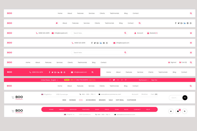
The Essence of User-Centered Navigation
User-centered navigation places the user’s needs at the forefront of design. It’s not just about arranging menus and links; it’s about understanding your audience’s behavior, preferences, and expectations. A well-crafted navigation system anticipates users’ actions and helps them effortlessly explore your content.
Simplify and Prioritise
When it comes to navigation, less is often more. Aim for simplicity by presenting users with a concise set of clear options. Prioritise the most important sections of your website to prevent overwhelming users with an excessive number of choices.
Intuitive Menu Design
Menus act as signposts, guiding users to their desired destinations. Whether you opt for a traditional horizontal menu, a sidebar menu, or a combination, ensure it’s intuitive. Use clear labels that resonate with your audience’s understanding and expectations.
Clear Hierarchy and Categorisation
Organise your content in a logical hierarchy that mirrors users’ mental models. Group related pages or sections together and use sub-menus to further categorize content. A clear hierarchy makes it easy for users to anticipate where they’ll find the information they need. Try not to make your visitors click more than twice to get to where they need to go.
Responsive Navigation
In today’s mobile-driven world, responsive navigation is paramount. Ensure your navigation adapts seamlessly to different screen sizes. Consider using a “hamburger” menu for mobile devices to conserve space while providing access to navigation options.
Consistency Across Pages
Users should be able to rely on consistent navigation elements across all pages. Keep menu placement, style, and terminology uniform throughout your website. This familiarity enhances user confidence and reduces friction.
Visual Clues and Feedback
Visual cues, such as highlighting the current page in the menu or using breadcrumb trails, provide users with a sense of orientation within your website. Feedback assures them that their interactions are registered.
Crafting a Seamless Journey
In the realm of website design, navigation is the compass that guides users on their digital journey. A user-centered approach to navigation isn’t just about arranging links; it’s about anticipating user needs, providing clear paths, and fostering a seamless browsing experience. When visitors effortlessly find what they’re seeking, they’re more likely to engage, convert, and return.
Remember, effective navigation evolves with your website and its users. Regularly analyde user behavior, adapt to changing trends, and keep refining your navigation strategy. By embracing user-centered navigation, you’re not only enhancing user experience but also ensuring your website becomes a destination users return to time and again.
Ready to lead your users on a journey of exploration and discovery? Let’s create a navigation system that transforms your website into a user-friendly haven, guiding visitors toward their desired destinations and making their online experience a truly enjoyable one.
Leave a Reply